Interface Writing: Code for Humans
I gave this talk at Burlington Ruby Conference in Vermont and Blend Conference in Charlotte, North Carolina.
The web and the world are full of instructions. Everywhere you go, signs and people are telling you what to do.
Walk. Don’t walk.

Follow me please. Stop. Hang on. Please stand clear.

Fasten your seatbelt. Read this.
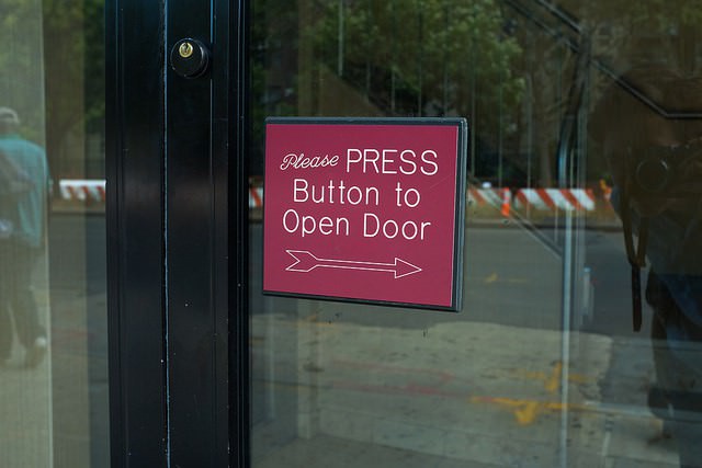
Do this.
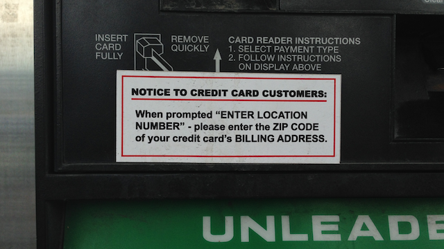
Take this. Buy this. Find us on Facebook. Please enter your name.

You get the idea. So bossy.
Think about the app you’re building right now.
What actions can people take? What are you asking them to do? What are you allowing them to do? What are the rules and dead-ends? What sort of language do you use to guide people?

Whatever you’re building, you need to think about the content in the database and the instructions around it. I call those things interface writing. Some people call them microcopy since they’re usually short.

Interface writing
- buttons
- notifications
- errors and alerts
- forms
- in-app disclosures
- links
- navigation
- product tours
- setting names
- tooltips
- transactional emails
From navigation links and buttons to product tours, forms, and error messages—every string in your database is an instruction. These are your signposts, and they grab your reader’s attention.
As developers and writers, you have a lot of power. The user wants something. Maybe it’s information, an easier way of doing things, chocolate chip cookies, or hilarious cat videos.

With clear instructions and a warm tone, you can help them find what they need quickly without having to ask anyone for help.
Let me tell you a story. This is my dad. He’s a test engineer. He works on semiconductors and develops tests for parts and batteries. So growing up, we always had computers around the house and the latest in PC technology.

We used to have this program called Dr. Sbaitso, which you may have heard of. It was a computerized psychologist slash artificial intelligence program designed to show off sound cards, but I thought it was a game and used to play with it for hours.
This is what it looked like. A typical, boring DOS interface.
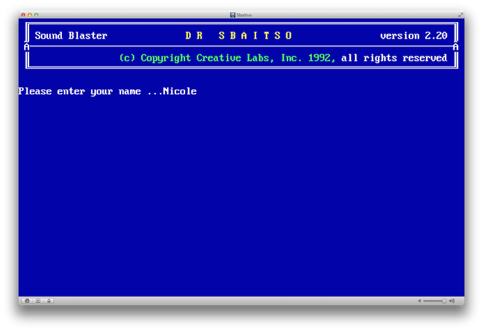
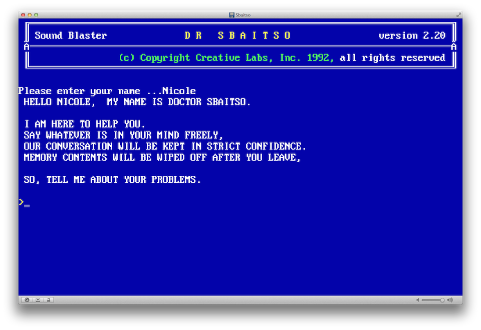
Dr. Sbaitso would tell me what to do and I’d tell him about my 9-year-old problems. At the time, I was usually hungry or tired or bored. So I would answer in one of three ways.
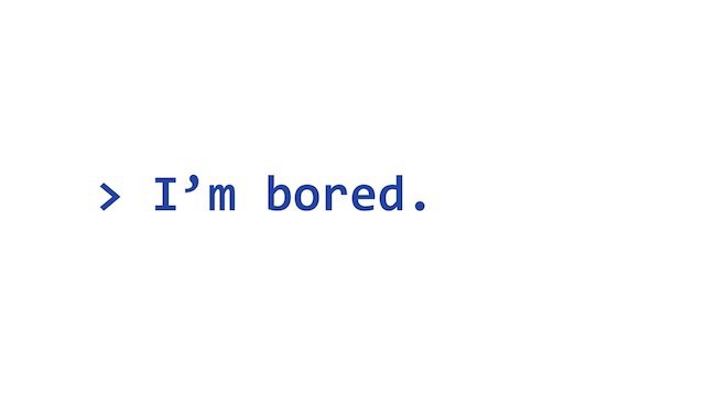
And then he would ask, “Why are you bored?” or “Are you sure you are bored?” And then I would say, yes, I’m sure and start repeating myself. Next thing I know, he’s shouting a zen koan at me like this:

And this would result in me having a tiny existential freakout. I would get sick of that topic and switch over to cussing or saying something inappropriate. And if I did that long enough, Dr. Sbaitso would throw a parity error.
The reason I bring this up is that it shapes how I think about interface writing. Dr. Sbaitso was pre-programmed with all of these different strings to respond with.
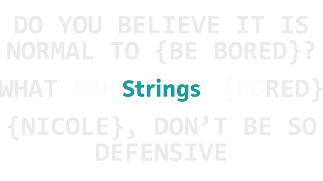
And while most of them were cold, poorly punctuated, and hilariously impersonal, the model of prompting the reader—this kind of call and response—really worked. It felt like a conversation. Maybe it was a little awkward, but it was a good start.
When you’re writing for the web, you’re having the same sort of conversation with your readers. You’re telling them to do something or asking them a question. Above all, you want it to make sense and feel natural to them. Our strings have to be useful—not funny—so we need to do the extra work of figuring out what our readers need. That makes it easier to show people around, ask for more of their time, or get them to take a particular action.
In his essay We Have Always Coded, Tim Maly says:
“It is no coincidence that many women have compared weaving code to instructing a child. With both kids and computers, you must carefully think through what you want them to do, and then carefully phrase your commands.”
From a high level, these are my goals when I’m writing strings:
- Be clear.
- Be kind.
- Be careful.
- Be honest.
Focus on the reader’s needs. Think about the implications of what you’re asking for. Be honest about what you’re doing with the data. That’s extremely important.

Frank Chimero says, “Every form is a question.” What are you asking through forms and flows? How can you make those questions meaningful and generous for your users?
Here are some examples of things you might be asking:
- How can we help you?
- What are you interested in?
- What do you think of this product?
- Do you need this in a hurry?
- Where do you live?
- Are you married or not?
- Where are you right now?
- How did you hear about us?
- Are you planning to go to this event?
- Are you willing to pay for this?
- Is it okay if we share this information?
- What do you think about when you’re alone?
You probably wouldn’t ask a complete stranger these things without a conversation or consent.
Each of these interactions should feel like a conversation between two people who trust each other and deserve each other’s trust. It can’t be one-sided. Unless you want to be cold like Dr. Sbaitso or creepy like HAL, you need to take the time to think about these prompts and put yourself in the reader’s shoes. So let’s talk about how to do this.
Tips
- Start with questions.
- Be a good tour guide.
- Turn your chair.
- Show you care.
- Write iteratively.
1. Start with questions.
It’s easy to ship something out in a hurry. Before you do, ask yourself a few simple questions:
- What is the user trying to do?
- What might they be feeling?
- How did they get here?
- What happens next?
- What do they need to understand?
- Why does this matter to them?
When you’re looking at a particular interface label or message, keep it short and focused on what the reader needs. (See the full list of research questions from my book.)
2. Be a good tour guide.
Think about what you’d do if one of your close friends came to visit you at work, or maybe they’re in from out of town. You’d probably show them a few of your favorite things. Give the reader that same sort of care. You know your apps and websites better than most people, so use that to your advantage.

If you’re not sure where to start, make a map for yourself. Take screenshots of each part of a flow and look at them together. Start with your signup, checkout, or donation flows. See where you can add specific details and useful examples to simplify your instructions.
Think about the hidden gems on your site too. If the user isn’t ready to make a purchase or sign up, what else can they do? I like to think of this as the Choose Your Own Adventure approach to web design. Don’t leave the user hanging, and watch out for dead-ends. Tell them what to expect and help them accomplish their goal.
Remember that you’re working with hypertext. You can include links or images to make your point.
Here’s an example from Pinterest. You can see the cocktail my friend Tom pinned, along with other pins he relates to this one and other pins from the source. Pinterest is also prompting me to sign up, since it only takes a second or two. They’re making all of those paths clear.
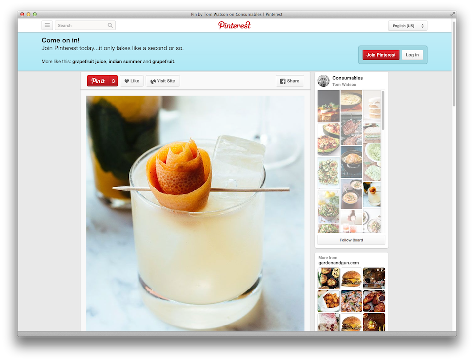
Every now and then, check your terms for clarity too. Make a list of the buttons and navigation links on your site to make sure they’re consistent. Some people call this a nomenclature audit. Here are some examples from Basecamp:
- Log in
- Sign up today
- Sign in
- Edit my identity
- Edit your info
- Settings
- Sign out
Right away, you can see which ones are too similar. They’re using both “Log in” and “Sign in,” so I’d suggest cutting the “Log in” language to simplify. You can also see that they’re having a trouble deciding if the reader is “you” or “me.” I usually go with “you” to avoid the confusion, but you could also cut the pronouns and possessive adjectives.
The terms you choose are a style choice; it’s not about right and wrong. But you should be consistent and match the language your users relate to. If you call something “notifications” in one place, call them “notifications” everywhere. That will help you reduce cognitive load on your readers and save money on translations, too.
3. Turn your chair.
Shift your focus to your readers. Talk to them, not at them. Use positive language and avoid yammering on about your company or your interface. The system isn’t the point.
Here’s a great example from Square Cash.
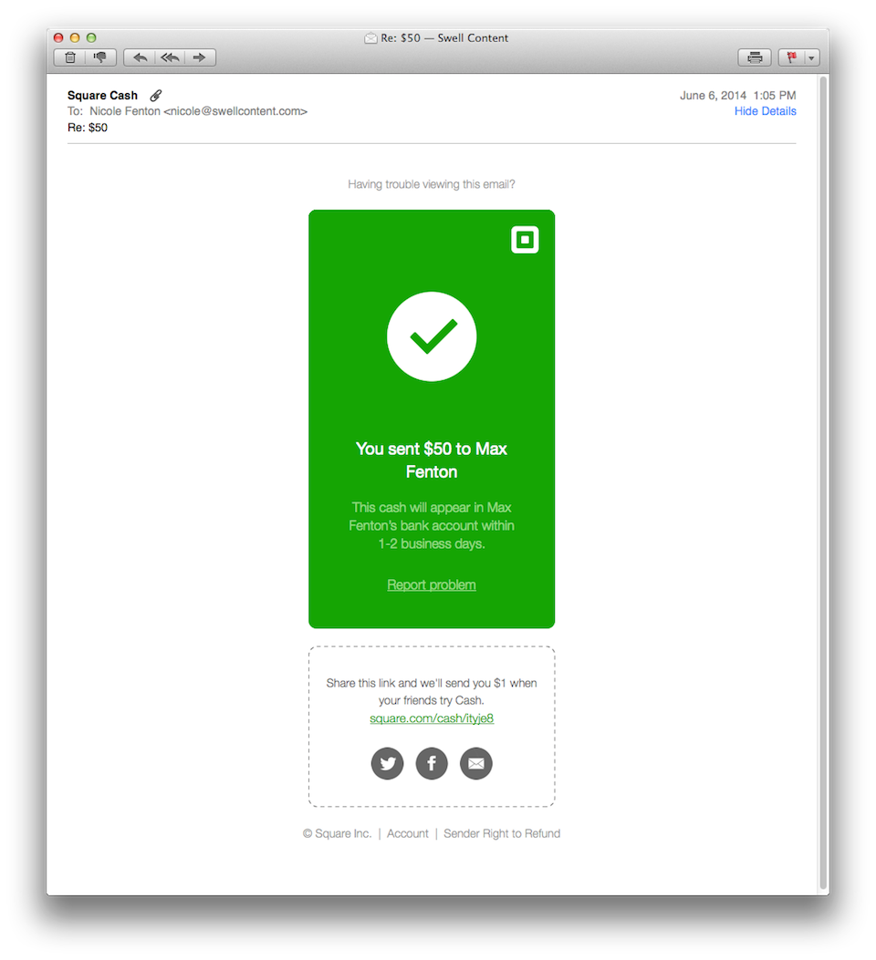
They’re telling me exactly what happened—I sent $50 to my husband—without yammering on about themselves. They didn’t say, “We have received your request to send $50...” or “Thanks for using Square Cash, the best way to send cash monies...” And that little “Report problem” link is simple and clear.
Here’s another example from Oyster, a book subscription service:
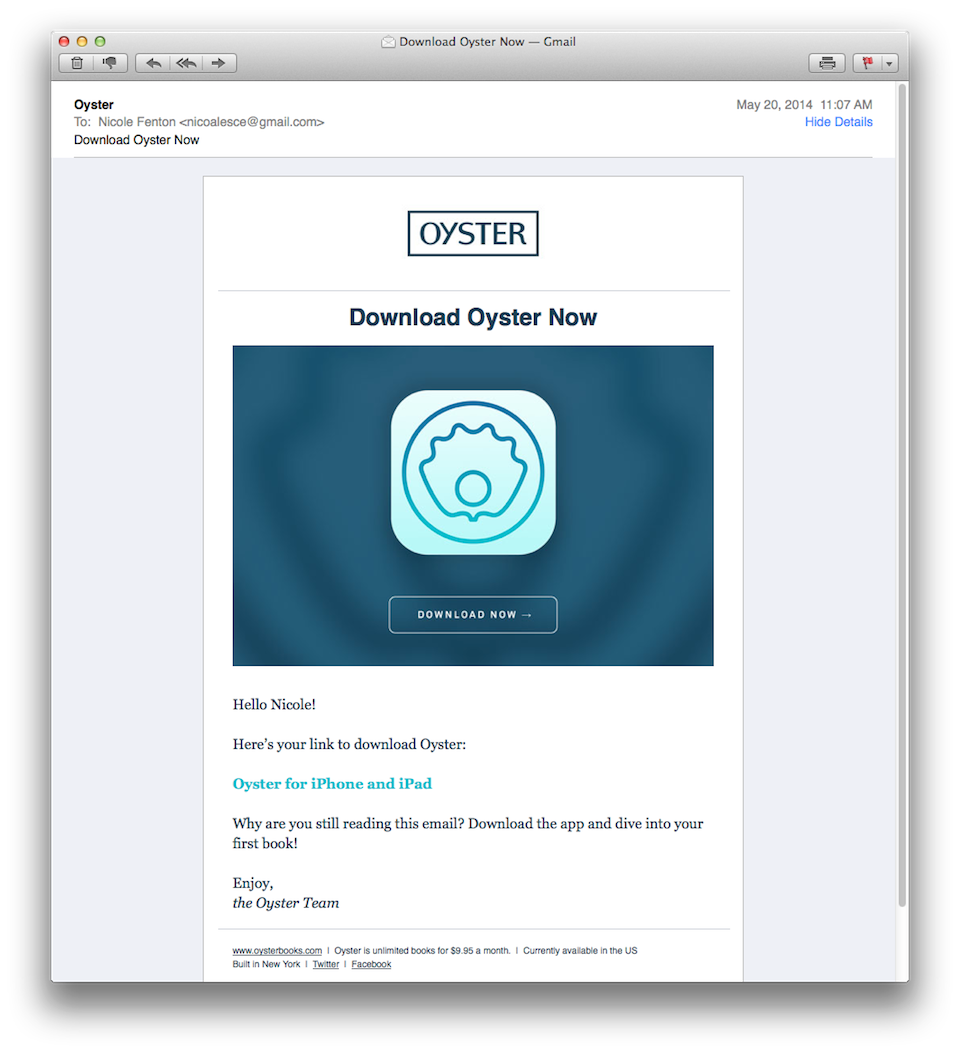
I signed up for their trial and they sent me a link to their mobile app. But instead of talking about themselves or explaining the features, they’re helping me get right to it. They say, “Why are you still reading this email? Download the app and dive into your first book!” I love that.
4. Show you care.
Now’s the time when I’ll tell you what not to do, since some people find that useful.

Don’t assume you’re the core audience. Most of the time, we’re not designing for ourselves. Think about the universe of people out there. Word choice is extremely important when you’re trying to grow.
Avoid jargon and catchphrases. Cut the bullshit. You don’t have to be hip or clever, but you do have to be nice.
Don’t assume dichotomies or binaries will do the trick. Not everything will fit into a boolean. Real life is complicated. As an example, some people are neither male nor female. They’re still people and they deserve our consideration.
Don’t interrupt. Keep things focused and make sure this is the best time to deliver this message.
Don’t be a robot. Don’t do this:
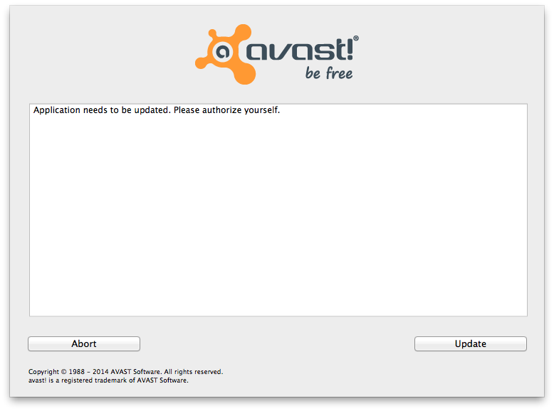
One way to avoid this is to read your work aloud before you ship it. If you work in an open office, it may seem embarrassing to mumble strings to yourself, but it makes a huge difference. Make sure it sounds like you, not too formal or stuffy.
Here’s a good example from GitHub.
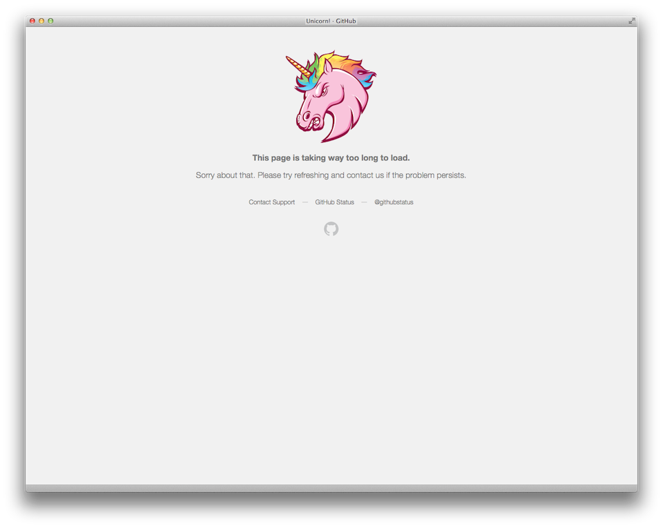
It sounds like it came from a person—and they get bonus points for recommending support links while the page is out of commission.
Here’s one from MailChimp.
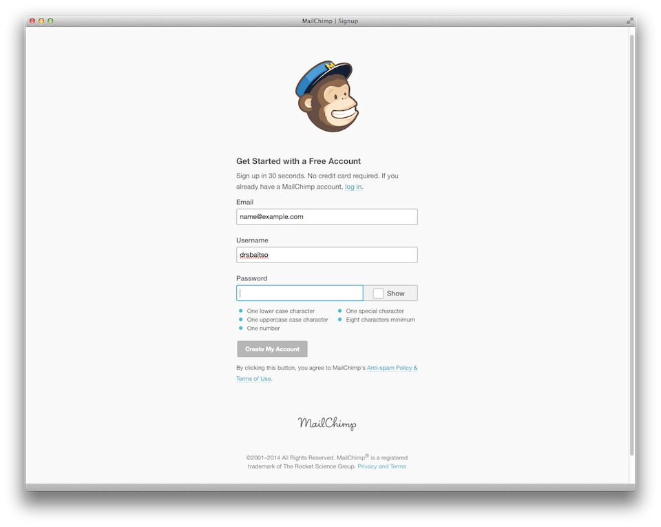
It’s friendly and clear. And they even take the time to show me what makes a good password so I don’t have to guess six times.
Don’t waste time. Your time is expensive, but your users’ time is what matters most. You work at an incredible scale—and if you’re lucky, hundreds of thousands of people will read your work. You have more readers than most published authors! Be proud and careful with that power.
As Paul Ford says in 10 Timeframes:
“The only unit of time that matters is heartbeats. The time you spend is not your own.”
5. Write iteratively.
You write code iteratively, so why not the rest of it? It’s okay if your interface writing isn’t perfect. But you better believe that you need to go back and clean up those strings before you go live.
One way to make that easier is to organize your code. Maybe you have a mailer folder for all of your emails or an errors folder for your error messages. You can do that in Ruby with your localization file. Make it easy for yourself and your team to keep things up to date. If you’re writing QA tests, please don’t hard code strings into them. Start with the assumption that the copy will change.
Writing is a messy, iterative process. Here’s an example of what a writing plan looks like for me. This is an illustration by Alvin Diec from the book I coauthored, Nicely Said.
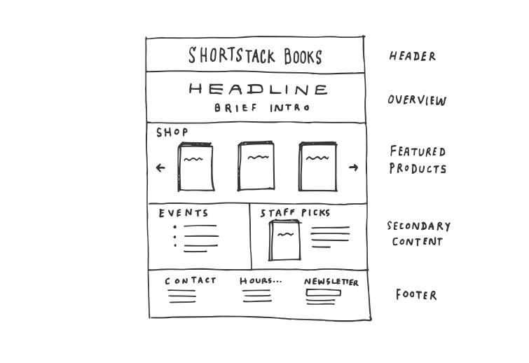
My process begins with the questions I mentioned, and then I sketch a rough outline like this. Next, I write a few variations. Here are some quick examples of a button label:
- Save
- Update
- Send
- Submit
- Post
- Publish
- Comment
From here, I usually narrow it down to two or three options. Writing copy variations makes it easier to come up with something good, and it also gives you a place to start when you’re A/B testing. Don’t be afraid to test calls to action and navigation labels. Those little details add up to huge improvements in conversion and engagement.
You should never test something you wouldn’t ship. Don’t throw your principles out for numbers. Your readers don’t know a test from a normal piece of text. If you’re not comfortable with a particular phrase, it doesn’t belong in a test.
Lastly, remember the text can change. Don’t try to perfect it the first time. Keep refining it. Make it clear, and then make it clearer. Find a way to build a system that works for your readers and your business.
Thank you.